Web Design Tutorial
Creating an HTML/CSS Web Page using Adobe Photoshop and Dreamweaver
Many people have told me that they wish that they could design web sites. So I thought I’d create this tutorial, since there doesn’t seem to be too many free courses online that teach both the graphic design skills and HTML and CSS necessary for creating web pages.
I would like to outline (not a good word for right brained people like me) a workflow (?) for creating a web page using my home page as an example and Windows as the operating system (Mac users will have to find alternate keyboard shortcuts). Since I am a self taught designer, I’m not sure how unconventional my methods will seem, but hope this will be helpful. As you know, technology quickly becomes obsolete, so may the expiration date on this project live long and prosper…
Adobe® Photoshop® is the industry standard for digital imaging. Since the web is a low res (72 dpi) graphics experience, the images that you create will not not need the kind of quality as print media. With photoshop, you can create RGB raster images, which basically means they’re quick and easy to work with. The tiny file sizes are perfect for the web. If you ever want to use them for anything else, like a magazine ad, you’ll find that the quality is not good enough (You may want to use Adobe InDesign® or Illustrator® for print media).
The types of files we will use are jpgs and gifs. Png files are the best, but we’ll have to wait until everyone stops using old web browsers.
I don’t know which version of Photoshop you have, so you’ll have to at least play around with it for a few hours to find out how the layers link together and other basics.
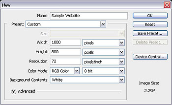
First, I’ll start off with a blank canvas. Because computer screen resolutions are becoming increasingly wide, very few people still have their displays set to 800×600 to surf the web. I’ll start with 1000×800 pixels, because that is a comfortable size for me to work within Photoshop and it will allow me to create a site that is a good size.
Select black (#000000) in your foreground color and then hold down Alt>Delete to fill the canvas with black as your background color. You can create gradient and textured backgrounds that tile, but here we’re just using solid black.
Create a new layer. Make sure that your rulers are set (View menu>Rulers). With your selection tool create a rectangle that is 880×190 pixels. You can tell the height and width by looking at the Info palette in the windows menu as you’re creating the rectangle. Select a color in your foreground color picker and then hold down Alt>Delete to fill the rectangle with color. I used orange for visibility. Drag and drop vertical guide lines from the ruler area to the dotted lines of the selection rectangle. Hold Down Control>Delete to deselect the rectangle.
I double click on the current layer to open the Layer Style box and check the Gradient Overlay checkbox and click on the words ‘Gradient Overlay’ to toggle to the gradient options. I click once on the color strip to open the Gradient Editor. Double click on the bottom left color stop and choose #a6d0ff. I double click on the bottom right color stop and choose #7588ff and click okay on all open dialogue boxes. Remember to save as often as possible.
I create a new layer. We’re going to create a series of radiating triangles that I like to call a ‘burst’. First, hold down the rectangle tool in the tool bar until you see a menu appear. Select the ‘custom shape tool’. In the tool options click on shape and select a triangle. If you don’t see a triangle, click on the small arrow in a circle toward the right of the box and choose ‘shapes’ from the drop down menu.
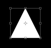
Choose white (#ffffff) as with your foreground color picker. Turn off layer 2 (the one that has the rectangle) by clicking on the eye. Make sure that layer 3 is selected and draw a white rectangle about 100×100 pixels. Hold down Control>T to transform the triangle. Grab the top anchor and stretch it. Then hold the shift key and the lower right anchor to scale it down to about 70×350 pixels.
Then hold the shift key and the lower right anchor to stretch it to about 70×350 pixels. Duplicate the layer and transform this triangle also. This time move the center point to the anchor at the tip of the arrow and rotate the entire triangle so that the second triangle tip stays in the same place and the base of the triangle begins to form a circle of triangles. Remember, the center point has to be moved to the anchor at the tip for this to work. When you are rotating you’ll see the rotation symbol when you mouse is just off an anchor.
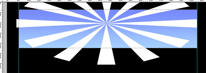
Repeat this until you have formed a complete circle of triangles. Merge all the layers of triangles together (select layers and hold Control>E) to form one layer. Turn on the rectangle layer to see it. Make sure you are on the ‘burst’ layer and transform (Control>T) the burst and move it until it covers the rectangle and the center point is about 2 thirds of the way up on the rectangle. Then select the rectangle layer and Select the negative space (black) by selecting the magic wand tool and clicking on the black.
Press the delete key to cut off the burst that ‘bleeds’ over the rectangle. Deselect the rectangle (Hold Control>D). Select the rectangle layer again and adjust the opacity to 11%.
It is now fun time with brushes. Since this is a personal site, there are many free brush downloads available. Just Google ‘photoshop brushes’ and find something you like. Download the file and add it to the brushes folder (C:\Program Files\Adobe\Adobe photoshop-version\Presets\Brushes). I found some stars and swirley borders on http://psbrushes.net/.
Create a new layer. Using the brush tool, and selecting a new brush, adjust the master diameter and click once over the rectangle. I added some stars on one layer and adjusted the opacity of the layer to 40%. On another layer, I added the swirley borders at 74%. The intention is to have very subtle effects that activates the plane with ‘energy’. Be sensitive and find what is pleasing to the eye.
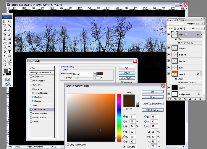
I applied some tree silhouette brushes that I also found on the web on a new layer. I didn’t want these to be solid black so I double clicked on the layer to open the Layer style box. I checked the color layer checkbox and toggled to ‘color overlay’. I selected #3e2613 with the color picker, clicked okay and made the opacity 17% on the color overlay color option.
I continued to add more tree brushes on different layers with the foreground color set to black. On the leaf brushes, I adjusted the layer style to have a green color overlay even though the actual brush color is black.
Fun time with type. If this were a company logo, then we would have to make a big deal out of this by carefully creating vector graphics that could be used in all applications and possibly spending a gazillion dollars on a font. However, since this is just my personal web site, all I need is Photoshop and Google to find a nice free font to download. I went to 1001Fonts.com and found this interesting font by Chris Hansen called “Got Heroin?”. Not crazy about the name, but I love the grunge look and feel.
Type is a powerful graphic element. There is about as much to learn about positioning type as there is in creating representational art. Quick tip: Click in between letters and use the (Hold down Alt key/arrow left or right) arrow keys to make sure that the closest space between letters is a small gap. This is an extreme oversimplification of typography, but nice to practice.
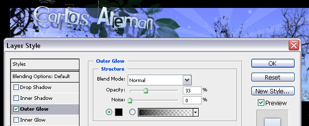
I took the ‘Carlos Aleman’ text and rotated it (Hold Ctr>T) slightly. Then I rasterized it (Layer>Rasterize>Type) so that I would be able to cut off some of the shapes (under the m and n) with the polygon lasso tool (select a region and use the delete button). Then I double clicked on the layer and added some layer styles (Gradient overlay and outer glow). I wanted a dark outer glow so that the text would be readable against a light background. The outer glow blend mode must be ‘normal’ for this to work.
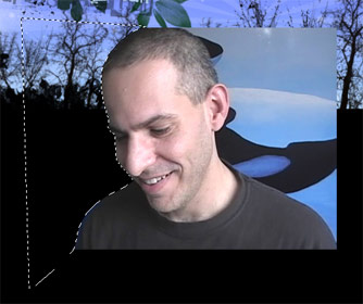
The next image shows a still from a video teaching series I had up on the web. I did a screen capture/shot of it and pasted it on a new layer. I needed to remove the background (yes, that’s a mural of some killer whales). There are many techniques to removing the background such as the background eraser tool, magic wand, extract filter and countless of other complex techniques. Sometimes you need to use a combination of techniques on different layers to take advantage of the effectiveness of each method on different edges.
One of the easiest methods is using the polygon lasso tool with anti-alias checked in the options. Since I don’t have much hair this will be an simple step. I just select areas around my head and press the delete button.
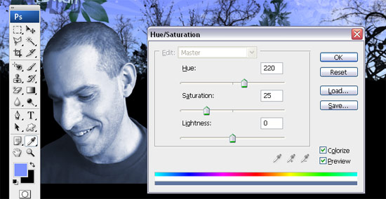
Here, I pick a color from the rectangle with the eye dropper tool and open my Hue/Saturation box (Hold Ctr>U). First I check the ‘Colorize’ check box. Make sure that the Preview is also checked. I slide the Hue a little into the bluer range and click okay.
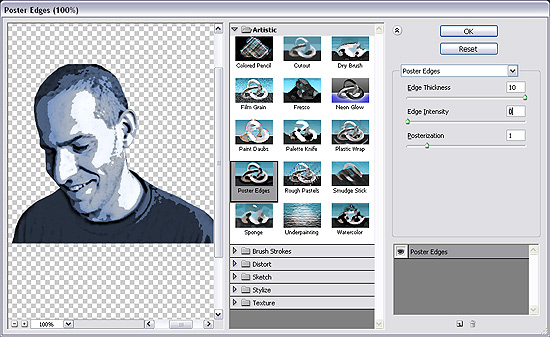
Duplicate this layer by dragging the layer to the New Layer icon. I want more of a high contrast ‘graphic novel’ effect to compliment the trees, so on the new layer I select filter>artistic>poster edges and slide the settings until I’m happy with the posterazation.
Click Okay and turn the opacity on that layer to 60% so that the filter effect ‘blends’ with the previous layer. Select both layers (link of shift key -depending on your version of Photoshop) and transform (Hold Ctr>T) to scale down and move over the rectangle.
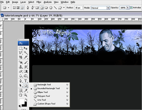
We need a main content area which will be a dark gray (#1e1f1f) rounded rectangle. Hold down the rectangle tool in the toolbar until you see a drop down menu and select the rounded rectangle tool. Make sure your options are set to ‘Fill Pixels’ (the third symbol on the options menu), Radius: 15pixels, Mode: Normal, Opacity: 100% and the Anti-alias is checked. Click and drag your mouse to create a rounded rectangle about the same width as the header rectangle. If you want to be precise, then drag vertical guide lines from the rulers so that the margins on the header and content area line up perfectly.
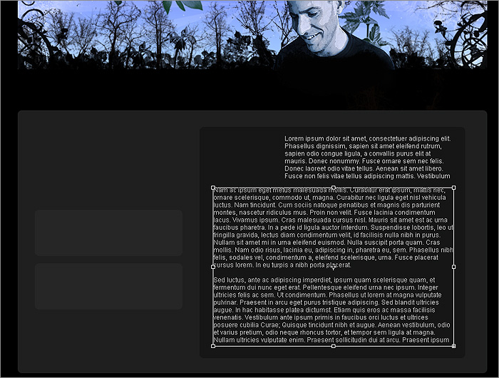
Continue working to layout content areas with rounded rectangles. Rounded rectangles are not only attractive, but they symbolize ‘environment’. Without rounded corners information will seem ‘boxed in’ and convey a sense of not belonging to anything meaningful. With the type tool click and drag text boxes where you will want type to appear. These are just place holders to conceptualize what the blocks of text will look like. I use Lorem Ipsum (dummy text) which has been used by printers for about 500 years. You can generate as many paragraphs of Lorem Ipsum at http://www.lipsum.com/. Just copy the text from lipsum.com and paste into the text box.
When choosing type for the web it is best to use san-serif (letters without a feature called serifs at the end of strokes) because small serif type does not pixilate well on computer screens. I use Arial, Helvetica, sans-serif ‘style’ as the ‘font’ because it is common to most computers (More on styles when I get to CSS in this tutorial).
When designing a page, try to be visually sensitive to the weight colors have and how they balance each other. This is an asymmetrical design. And here is my thinking behind it: The right column is wider than the left, so my first instinct would be to make it a lighter color thus making it weigh less on the see saw, however I know that it will be mostly text and the narrow left column will be rich with graphics. So I will do the opposite and create more weight on the right to hoping that the darker larger area will balance the heavy and narrow left column. To say that this is what I’m ‘thinking’ isn’t really accurate, this is what I am ‘feeling’. And it is still debatable whether I actually achieved balance.
Another thing to keep in mind is that this is a personal web site, so I have total control over how much every element is going to affect the overall design. When designing professionally you have to anticipate that content will be in a state of flux and that the design has to be flexible. This may limit your creativity but it will also challenge you. Technical work-arounds offer the opportunity to demonstrate a different kind of creativity..
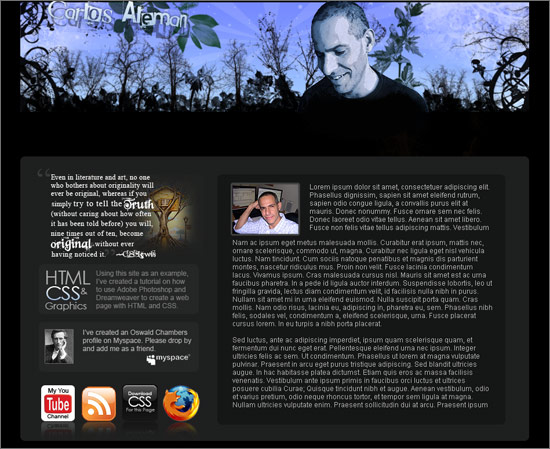
I’ve laid out some body content by adding layers and scaling images. Notice that I left a gap between the header and the main content area. That is where the navigation menu is going to be positioned.
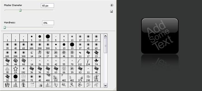
If you’re wondering how I create the graphics with the reflection, here’s the technique for the ‘download css’ button. First of all, the reflection is an old advertising trick. Have you ever noticed in car commercials how the car is driving down a wet road. That’s because the advertisers know how beautiful cars look with a reflection and they want you to fall in love with the car and spend lots of money. Symbols with reflections are very popular ‘web 2.0’ graphics. They may become dated eventually, but then again, no one is getting tired of cars on wet roads.
To make a shiny reflective ‘web 2.0’ graphic begin with two overlapping shapes on different layers. I made these with the rounded rectangle tool. One shape is green for better visibility.
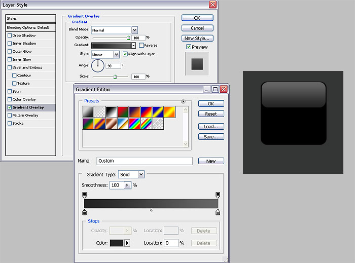
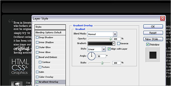
I double click the layer with the green rectangle to open my Layer Style box. Then I toggle to the Gradient Overlay and click once on the gradient color strip which opens the Gradient Editor. Make sure all the settings are as shown below. Double click on the bottom left color stop and pick a color that is almost as dark as the shape on the other layer. In this case it would be a dark gray that is close to black but light enough to create a visible distinction between the two. Click okay and double click on the bottom right color stop and pick a color that is lighter than the first. You’ll have to experiment with the transition until it looks like light actually reflecting on the top of a 3D shape.
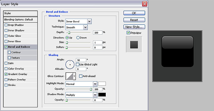
Click okay on the gradient editor and select the ‘Bevel and Emboss’ style. Use the settings below, remember to uncheck the ‘Use Global Light’ checkbox. Click okay after you’re done.
Create a new layer and add anything you want. I added some random text. Select the three layers (2 rectangles and text layer) and drag them to the new layer icon to duplicate them. Now take the new 3 layers and merge them (Hold Ctr>E) together. From the menu select Edit>Transform>Flip Vertical. Move the new upside-down shape below the first.
Make sure the layer with the new shape is selected and click on the eraser tool and choose a brush with a 0% hardness and begin erasing the bottom of the shape until the reflection looks convincing.
Now that I know what the content will look like, I can create a menu navigation bar that visually compliments both the header and body. First, I create a white nav bar with the rounded rectangle tool.
On the nav bar layer, double click to open the Layer Style box. Select the Gradient Overlay and choose a gradient that goes from dark to a slightly lighter gray while still visible against the black background.
On a new layer create another white rectangle with the rounded rectangle tool that covers the top half of the nav bar.
Using the same technique as the ‘download css button’ example add a gradient and a bevel effect.
As I write this, diagonal stripes are a popular web design element. I will add some soft stripes to my nav bar. First, you need a pattern that will tile (repeat) and form a perfect stripe effect. I went to stripegenerator.com/ and created the image below.
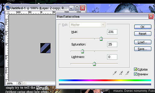
Now I want to tweak this image a little to match the color scheme of the design. Using the eye dropper tool, I select a color from the header and open the Hue/Saturation box (Hold Ctr>U) and click the ‘Colorize’ check box and click okay.
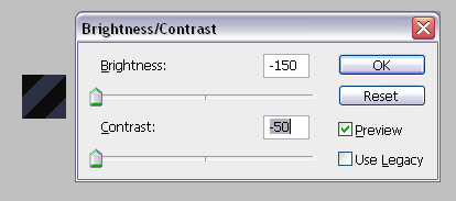
Now I want to create a more subtle contrast, so I open the Brightness/Contrast box (Image>Adjustments>Brightness/Contrast) and move the levels to the left (Brightness minus 150 and Contrast minus 50). Click Okay.
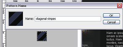
Now select the entire canvas of the stripe image (Hold Ctr>A) and define a pattern (Edit>Define Pattern). Give it a name and click okay.
Go back and select the main canvas that we have been designing the site on. Select the layer with the nav bar and duplicate it by dragging it to the new icon layer. Now take this new layer and drag it up one layer so is above the layer that we created the overlapping rectangle on. Take the magic wand tool and click once on the duplicated rectangle to select it.
Double click on the layer and turn off all the layer styles by unchecking them. Open the fill box (Hold Ctr>F5) and select ‘Pattern’ from the drop down menu and then select the stripped pattern from the ‘Custom Pattern’ drop down list.
Click okay and turn down the opacity of the layer to about 10%. Keep in mind that people will have their laptop screens at different angles thus creating different contrast effects for the stripped menu. Experiment with opacity and find a happy medium which will work with different screen effects.
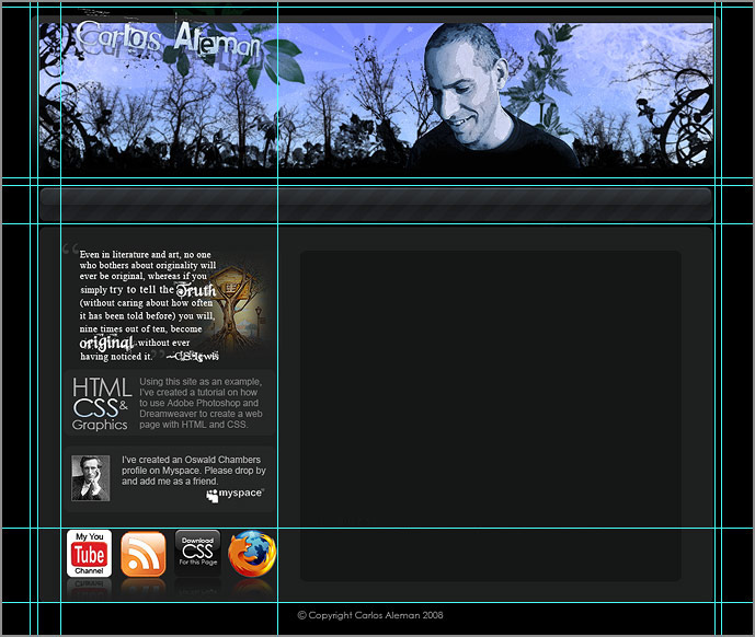
With your rulers on (Hold Ctr>R), drag and place guidelines from the ruler to divide up the design into the images that you will use for the web page. You don’t want one very large image that will take long to load and you don’t want tons of tiny images that make the design of the page too complicated. You can just create some place holder images now to get you started and go back and improve on them later.
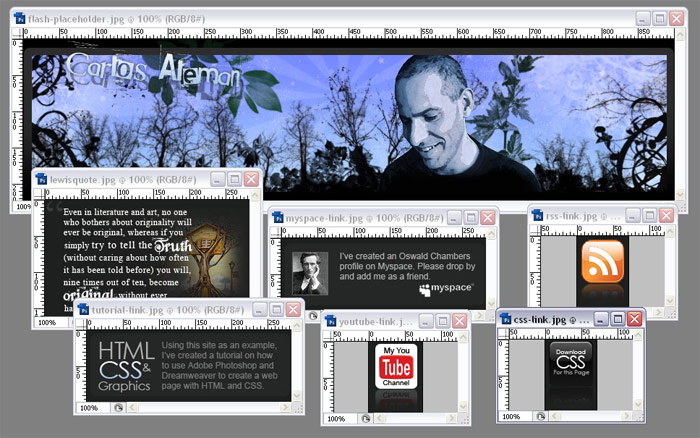
Duplicate the entire canvas (Image>Duplicate) and flatten all the layers on the new canvas (Layer>Flatten Image). With the Rectangular Marquee tool, select one area and copy (Hold>Ctr>C). Create a new layer (Hold>Ctr>N) (the new layer will automatically have the correct proportions) and paste (Hold>Ctr>V).
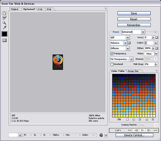
Now you have to optimize the image for the web. Save for web (Hold Ctr>Shift>Alt>S) or File>Save for Web). You will have to experiment for the lowest file size with acceptable quality. For small graphics, sometimes .gifs have a lower files size. This Firefox logo is being saved at about 3K as a .gif. Sometimes jpgs will give you lower file sizes for larger images, but text will become pixilated if the quality is below a certain percentage (65% works well for me on text oriented jpgs). With high speed connections becoming ubiquitous, I’m not as obsessive about file size as I use to be, but small is very important. Create a folder for your project and create a sub folder called images. Save all your images to the images folder.
Now we’re done with the design.
I’m professional web developer with 6+ years experience. My wide range of knowledge in web development using PHP, jQuery, WordPress, Magento, Symfony, Smarty and Web Scrapping. I am working with strong enthusiastic team (Group of friends) with spirit. So we provide all web development related solutions like HTML/CSS development, Web Graphic design and LOGO.
animations, graphics, photoshop, web

